
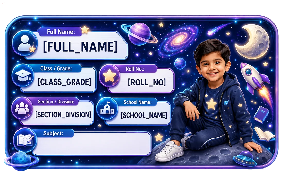
Quick answer: how should a long name fit on a school Name Slip?
Start by keeping the child’s correct identifying name intact.
Then:
- remove optional fields that are not needed,
- avoid adding duplicate information,
- use a balanced line break where the product/layout supports it,
- consider the larger available Name Slip size,
- keep the child name visually stronger than supporting fields,
- inspect the personalized preview before approval.
Do not automatically shorten a child’s name or replace it with initials purely to make the design cleaner.
If the school or family normally identifies the child by a particular shortened form, preferred name or initials, that is a separate identity decision—not a typography trick.
On this page
- Quick answer: how should a long name fit on a school Name Slip?
- The long-name decision at a glance
- 1. IDENTIFY — what name should actually appear?
- Full legal name vs school-use name
- Should I remove the middle name?
- Should I use initials?
- Initials are an identity decision, not a design hack
- What about hyphenated or double surnames?
- What about two first names?
- 2. PRIORITIZE — remove unnecessary competition around the name
- Which field should you remove first?
- What if every field is genuinely required?
- 3. FIT — use the space without destroying readability
- When should a name use two lines?
- What is a natural line break?
- Is one line always cleaner than two?
- Is two lines always better for a long name?
- Character counts are useful only when they are product-specific
- Spaces and punctuation also affect fit
- Uppercase vs title case
- What about font choice?
- What about reducing font size?
- Photo + long name is a special density problem
- Long name + subject
- Long name + school name
- Long name + roll number
- 4. PREVIEW — the real product decides
- The Dimple long-name rule
- Dimple’s two-size Name Slip format
- Does a smaller Name Slip mean I should shorten the name?
- What if the long name only fits on the large slip?
- Full name, first name, or first name + surname?
- What if two children in the class have the same first name?
- What if siblings have similar long names?
- What if the child prefers a nickname?
- What if the school requires the full name?
- What if the school specifies uppercase?
- What if the child’s name contains an apostrophe or hyphen?
- What about accented or non-English characters?
- What about names written in Hindi or another Indian language?
- Long names on school books vs smaller stationery
- Long names and public-facing items
- A long-name priority ladder
- 8 common mistakes with long names
- A 60-second long-name test
- Long-name example 1 — first name + surname
- Long-name example 2 — multiple given names
- Long-name example 3 — hyphenated surname
- Long-name example 4 — similar sibling names
- Should the surname be smaller than the first name?
- Should all letters be the same font size?
- What if the Dimple preview clips the name?
- What if the preview automatically makes the text smaller?
- Can Dimple guarantee every possible name will fit?
- The Dimple four-step long-name decision
- Before you approve
KRISHNAMURTHY
Neutral editorial examples using fictional details. These are not Dimple product previews or promises of editable layouts.
Some child names fit almost anywhere.
For example:
IRA JAIN
Others naturally need more room:
AARADHYA KRISHNAMURTHY
Or:
ANANYA RHEA FERNANDES
Or:
ARJUN SINGH RATHORE
Or a child may use:
- two given names,
- a middle name,
- a compound surname,
- two surnames,
- a hyphenated name,
- a school-specific name format.
A small school Name Slip has limited space.
That creates an easy design temptation:
make the name smaller until it fits.
But that is not always the best answer.
The child’s name is usually the most important ownership signal on the label.
If the name becomes so small that it is hard to read, the design has protected the layout at the expense of the label’s main purpose.
A better approach is:
Identify → Prioritize → Fit → Preview
First decide which name the child should actually be identified by.
Then decide which supporting school details are genuinely necessary.
Then use the available layout/size intelligently.
Finally, inspect the real personalized preview.
The long-name decision at a glance
| Question | Why it matters | Better response |
|---|---|---|
| What name does the school/family use? | Identity comes first | Use the correct identifying form |
| Are all other fields necessary? | Extra fields compete for space | Remove optional clutter first |
| Can the name break naturally? | A second line may preserve readability | Use a meaningful line break where supported |
| Is the smaller slip too dense? | Physical space is limited | Consider the larger size |
| Does the photo/theme take too much room? | Visual elements also consume space | Check overall hierarchy |
| Does the preview still read clearly? | Theory is not enough | Let the final preview decide |
1. IDENTIFY — what name should actually appear?
Before thinking about font size, answer:
What name should identify the child?
That could be:
- full legal name,
- commonly used school name,
- first name + surname,
- first name + initial,
- another family/school-approved form.
There is no universal rule that every school item must display the child’s full legal name.
There is also no universal rule that long names should be shortened.
The school’s instructions and the family’s chosen identifying format come first.
Full legal name vs school-use name
Use the identifying form required by the school and agreed by the family. Ordinary belongings do not automatically need every part of a legal record, but a required name should not be silently shortened to suit the design. Decide the correct identity first, then address the layout.
Should I remove the middle name?
Only if the middle name is not needed for the intended identification and the family/school is comfortable omitting it.
Do not remove it merely because:
- the design looks cleaner,
- another seller recommends fewer characters,
- the name is visually long.
The goal is not:
shortest possible name.
The goal is:
clear enough identity with readable typography.
Should I use initials?
Initials can save space.
But they can also reduce clarity.
For example:
A. SHARMA
may be enough in one context.
In a sibling family with:
Ananya Sharma
and:
Aarav Sharma
it may be ambiguous.
For another child:
A. K. KRISHNAMURTHY
may preserve more identity than an extremely tiny full name.
There is no universal best practice.
Use initials only when they still identify the child clearly and align with school/family convention.
Initials are an identity decision, not a design hack
This is important.
Do not think:
“The name is too long, so let’s randomly remove letters.”
Instead ask:
- Does the school use this initial form?
- Will a teacher recognize it?
- Could it be confused with another child?
- Is the surname distinctive enough?
- Does the family actually use this format?
If the answer is no, keep looking for a layout solution before changing the identity.
What about hyphenated or double surnames?
Treat them as the child’s real identifying name if that is how the family/school uses them.
Examples:
MAYA SEN-GUPTA
ISHA MEHRA KAPOOR
Do not automatically:
- drop one surname,
- remove the hyphen,
- compress spacing
just to make the label fit.
A layout should adapt to the identity where possible.
What about two first names?
The same principle applies.
For example:
ANNA MARIA D'SOUZA
If “Anna Maria” is the child’s normal identifying first name, do not arbitrarily reduce it to “Anna” for visual convenience.
If the child/school routinely uses “Anna,” that may be fine.
Identity practice comes before typography.
2. PRIORITIZE — remove unnecessary competition around the name
Long-name problems often become worse because the Name Slip is carrying too many other fields.
For example:
AARADHYA KRISHNAMURTHY
CLASS 3
SECTION B
ROLL NO. 17
MATHEMATICS
BRIGHT STARS SCHOOL
Photo area (layout example)
That is a lot of information competing for limited area.
Before shrinking the name, ask whether every supporting field belongs there.
Which field should you remove first?
There is no universal order.
But optional fields should be challenged before the primary identity.
Ask:
SCHOOL NAME
Is it actually needed on this item?
SUBJECT
Is the subject already obvious from the cover?
ROLL NUMBER
Does the school actively use it?
SECTION
Is class alone enough for this item?
PHOTO
Does the family want it, and is there enough room?
The point is not:
“remove all details.”
It is:
do not sacrifice name readability to preserve optional clutter.
For field-selection guidance:
What if every field is genuinely required?
Then the layout and size need to do more work.
Possible responses include:
- use the larger available Name Slip,
- use a theme/layout with more text room,
- allow a natural two-line name where supported,
- reduce visual decoration around the text if the real product system supports alternative designs,
- inspect the preview carefully.
3. FIT — use the space without destroying readability
The physical label cannot expand infinitely.
At some point, the name and details need to fit within the available area.
But “fit” should not mean:
technically inside the border.
It should mean:
comfortably readable in the final product.
When should a name use two lines?
A two-line name can be helpful when the full name is too wide for one line.
Examples:
AARADHYA
KRISHNAMURTHY
or:
ANANYA RHEA
FERNANDES
A useful line break should follow the natural structure of the name.
Avoid arbitrary breaks such as:
AARADHYA KRISHNA
MURTHY
unless that is actually how the name is written.
Do not break a name merely to create symmetry.
What is a natural line break?
A general layout can break between meaningful units, such as given names and surname, instead of splitting a word in the middle. Dimple’s current form does not expose a manual line-break control. The neutral two-line examples here explain typography, rather than promising a customization feature; check the actual generated preview.
Is one line always cleaner than two?
No.
One very tiny line can be less readable than two clear lines.
For example:
AARADHYA KRISHNAMURTHY
compressed into tiny text
may be harder to read than:
AARADHYA
KRISHNAMURTHY
at a more comfortable size.
The purpose of the Name Slip is identification, not preserving a one-line aesthetic at all costs.
Is two lines always better for a long name?
Also no.
A two-line name uses more vertical space.
That can compete with:
- class,
- section,
- roll number,
- photo,
- theme artwork.
Use the actual preview.
There is no universal “names over X characters must use two lines” rule unless the Dimple product system explicitly enforces one.
Character counts are useful only when they are product-specific
A count alone does not describe text width: fonts, letter shapes, spaces and punctuation vary. This guide gives no tested Dimple character capacity or universal fit guarantee. Judge the actual name in the current product preview.
Spaces and punctuation also affect fit
Name length is not only about the number of letters.
These examples behave differently:
ANANYA SHARMA
ANANYA-RHEA SHARMA
ANANYA RHEA FERNANDES
A. R. FERNANDES
Spaces, hyphens, apostrophes and punctuation all affect text width.
So even a character-count rule can be misleading.
The rendered preview is more useful than raw character count alone.
Uppercase vs title case
For example:
AARADHYA KRISHNAMURTHY
versus:
Aaradhya Krishnamurthy
may occupy visual space differently depending on the font.
Do not change capitalization just to force fit if the family/school expects a particular name style.
If Dimple’s templates use a set typography treatment, preserve that product design.
Do not present capitalization as a universal space-saving trick.
What about font choice?
Dimple’s typography belongs to the selected template. The current form does not offer a font-selection control. Compare available designs and inspect the resulting name rather than assuming you can choose a condensed font or set its size.
What about reducing font size?
Some reduction may be necessary in any responsive personalized design.
But the final text still needs to function.
The wrong goal is:
make it fit at any cost.
The better goal is:
keep it readable at actual printed size.
If the preview becomes too small:
- remove optional details,
- use a more suitable format,
- consider the larger slip,
- verify whether another current Dimple theme offers more text room.
Photo + long name is a special density problem
A photo uses physical space.
A long name uses physical space.
Add:
class, section, roll number,
and the design can become dense quickly.
That does not mean parents with long-name children should avoid photo Name Slips.
It means the photo decision should be made alongside:
- name length,
- school fields,
- label size,
- theme layout.
For photo selection:
For photo vs text-only:
Photo Name Slips vs Text-Only Name Labels: Which Is Better for School?
Long name + subject
Subject is often optional or item-specific.
For example:
AARADHYA KRISHNAMURTHY
MATHEMATICS
may work well on a large plain notebook.
But if:
- the cover already says Mathematics,
- class/section are also present,
- a photo is included,
subject may be the easiest field to remove.
Do not repeat information merely because the personalization form allows it.
Long name + school name
A long school name can compound the problem.
Imagine:
AARADHYA KRISHNAMURTHY
THE INTERNATIONAL ACADEMY OF ...
Now two large text blocks compete.
Ask whether the school name is genuinely needed.
If it is:
- prioritize the child name,
- keep the school name visually secondary,
- choose an appropriate layout.
Do not shrink both equally.
Long name + roll number
Roll number is usually compact.
For example:
ROLL 17
This can be easier to accommodate than a long school name or subject.
But it should still only be included if:
- confirmed,
- useful,
- appropriate.
Do not guess the roll number simply to complete a format.
4. PREVIEW — the real product decides
Long-name advice becomes abstract until the actual child name enters the real Dimple design.
The preview should answer:
- Is the entire identifying name visible?
- Is any part clipped?
- Is the font too small?
- Is the line break natural?
- Does the photo leave enough room?
- Are class/section/roll details still readable?
- Does the name remain more prominent than secondary fields?
- Does the chosen theme still feel balanced?
The preview is where theory becomes product truth.
The Dimple long-name rule
Use this rule:
Do not approve a long name because it technically fits. Approve it because it remains comfortably readable.
That is the central decision.
Dimple’s two-size Name Slip format
One current printed 12 × 18-inch sheet contains 25 slips: 20 large slips at 8.5 × 5 cm and five small slips at 5 × 4 cm. It uses one child/details/theme set. Both sizes are included; they are not separate large-only and small-only purchase options. Extra physical room may help a longer name, but fit still depends on the actual rendering. See the Name Slip size guide.
Does a smaller Name Slip mean I should shorten the name?
Not automatically.
First ask:
- Is the small slip necessary for this item?
- Are optional fields consuming space?
- Can the item use a larger slip?
- Does the school require the full identifying name?
The small format should not dictate the child’s identity unless the family/school is already comfortable with a shorter form.
What if the long name only fits on the large slip?
Then the large slip may be the more appropriate product size for that information density.
Use the small slips on items where:
- the available space is smaller,
- fewer fields are needed,
- the current personalized preview remains readable.
Do not promise that the same dense layout works equally on both sizes.
Full name, first name, or first name + surname?
There is no universal answer.
FIRST NAME ONLY
May work when:
- the name is distinctive enough,
- the school permits it,
- the item stays within a small class context.
FIRST NAME + SURNAME
Often provides stronger identification.
FULL MULTI-PART NAME
May be needed when:
- that is the child’s normal school identity,
- the school requires it,
- there are similar names.
The family and school should choose the identity format.
Once that identity decision is made, preserve its readability in the actual layout.
What if two children in the class have the same first name?
Then first name only may be too ambiguous.
Possible distinguishing information:
- surname,
- class/section,
- roll number where used,
- photo where appropriate.
Do not shorten so aggressively that the label loses the information needed to distinguish the child.
What if siblings have similar long names?
This is a separate multi-child issue.
For example:
AARADHYA KRISHNAMURTHY
and:
AARAV KRISHNAMURTHY
The surname alone does not help much.
Keep the first/given name clear.
For sibling organization:
Name Slips for Siblings: How to Organize School Labels for Two or More Children
What if the child prefers a nickname?
A nickname may be meaningful socially but may not match the school’s identification system.
Examples:
Official/school use:
ARJUN MEHRA
Nickname:
AJ
Do not automatically print the nickname just because it is shorter.
Ask:
- Does the school recognize it?
- Will a teacher know whose item it is?
- Is the family comfortable using it?
A shorter name is only useful if it still identifies the child.
What if the school requires the full name?
Then use the full name.
The layout should adapt around that requirement.
Do not remove legally/school-required parts of the name simply because a theme is crowded.
Possible response:
- use larger format,
- reduce optional fields,
- use a less dense design if available,
- check line break,
- verify preview.
School requirement outranks aesthetic preference.
What if the school specifies uppercase?
Follow the school.
Do not override school formatting to save space.
If the current Dimple template cannot display the required format readably, that is a product-fit issue to resolve before approval—not a reason to alter the required identity silently.
What if the child’s name contains an apostrophe or hyphen?
Keep punctuation that belongs to the child’s identifying name, such as D’SOUZA or SEN-GUPTA. Enter the intended spelling and check the exact generated result. Input acceptance alone does not prove faithful printed rendering.
What about accented or non-English characters?
Check the exact name and characters in the personalized result before approval. A website accepting text does not establish that every character is rendered correctly by every product template.
What about names written in Hindi or another Indian language?
Use the personalized preview to inspect the exact script and characters you intend to print. This guide makes no tested script-support promise. If the result is unclear or incorrect, seek help before approving it.
Long names on school books vs smaller stationery
The same identifying name may need a different information density depending on the item.
BOOK / NOTEBOOK
More surface area may allow:
- full name,
- class/section,
- photo.
PROJECT FILE
May justify:
- full name,
- class/section,
- roll number.
SMALL STATIONERY
Less physical room may require:
- simpler information,
- or a different product/label type.
Do not force a detailed large-format Name Slip concept onto a tiny object.
For item selection:
Long names and public-facing items
Do not add more personal information merely because the name itself is long.
Name length and privacy are separate questions.
For a public-facing bag, for example, the family may choose less visible information than on an internal notebook.
A long name does not justify:
- phone number,
- school name,
- extra identifying detail
unless those fields independently serve a purpose.
For field/privacy decisions:
What Should You Put on a Child’s School Name Slip? Name, Class, Section, Roll Number & Privacy Guide
A long-name priority ladder
When the layout feels crowded, solve it in this order:
1. KEEP THE CORRECT IDENTITY
Do not casually alter the child’s identifying name.
2. REMOVE DUPLICATED INFORMATION
If subject is already obvious, do not repeat it.
3. QUESTION OPTIONAL FIELDS
School name? Roll? Photo? Subject?
Keep only what serves the item.
4. USE THE BETTER LAYOUT
Choose a format/theme with enough text room if current options permit.
5. USE THE APPROPRIATE SIZE
Larger format where it makes sense.
6. USE A NATURAL LINE BREAK
Only where supported and readable.
7. CHECK THE PREVIEW
Never assume.
This order protects identity before decoration.
8 common mistakes with long names
1. Shrinking the name first
The main identity becomes the smallest element.
2. Removing part of the name without thinking about identification
Design convenience should not create ambiguity.
3. Keeping every optional field
Crowding is often caused by supporting details, not the name alone.
4. Splitting a name in the middle of a word
Line breaks should follow meaningful name units.
5. Forcing a long name into a small slip when a larger one fits the item
Use the format intentionally.
6. Letting the photo/theme dominate the name
Decoration should not bury identity.
7. Importing another brand’s character-limit rule
Dimple’s own preview/product behavior is the source of truth.
8. Approving because the name technically fits
Readable is more important than barely contained.
A 60-second long-name test
Before approval:
READ
Can you read the child name immediately?
DISTINGUISH
Could this name be confused with a sibling/classmate if shortened?
REMOVE
Is any optional field unnecessary?
FIT
Would the larger slip/layout help?
BREAK
Is a natural line break better than tiny text?
PREVIEW
Does the actual personalized result still look clear?
If the answer to the final question is no:
do not approve yet.
Long-name example 1 — first name + surname
AARADHYA KRISHNAMURTHY
Potential approaches:
One line
Only if it remains comfortably readable.
Two lines
AARADHYA
KRISHNAMURTHY
Potentially clearer if supported.
Shortening to initials
Not automatically recommended.
Use only if it matches the child’s real school identity.
Long-name example 2 — multiple given names
ANANYA RHEA FERNANDES
Possible natural break:
ANANYA RHEA
FERNANDES
But do not treat this as universally correct.
The family/school’s naming convention matters.
Long-name example 3 — hyphenated surname
MAYA SEN-GUPTA
Do not remove the hyphen merely to save width.
Try:
- one line if readable,
- natural line break,
- fewer supporting fields,
- larger slip where appropriate.
Long-name example 4 — similar sibling names
AARADHYA KRISHNAMURTHY
AARAV KRISHNAMURTHY
Using:
A. KRISHNAMURTHY
for both creates ambiguity.
This is where shortening can make the label worse.
Identity clarity wins.
Should the surname be smaller than the first name?
It can be a design choice, but do not recommend it universally.
If surname is necessary to distinguish the child, making it too visually weak can reduce usefulness.
Use the actual Dimple design hierarchy.
The child name as a whole should remain legible.
Should all letters be the same font size?
Judge the child’s identifying name as a whole in the selected design. Every essential part should stay legible, even where the template emphasizes some text more strongly. Font adjustment is not assumed to be a customer control.
What if the Dimple preview clips the name?
Do not approve it.
This should trigger:
PRODUCT/PREVIEW DEFECT OR FIT REVIEW
Possible actions:
- verify entered spelling,
- try an appropriate available theme/layout,
- reduce optional fields if possible,
- use larger Name Slip if applicable,
- escalate product-rendering issue.
Do not tell the parent to accept clipping.
What if the preview automatically makes the text smaller?
Judge the actual result.
Automatic fitting can be useful.
But if the final text is too small to read comfortably, the design still needs adjustment.
Do not equate:
“software fit succeeded”
with:
“human readability succeeded.”
Can Dimple guarantee every possible name will fit?
This guide offers no universal fit guarantee. Name length, word shape, script, punctuation, photo, school fields and template all affect the result. Review the exact personalized preview and seek help if any essential part is clipped or difficult to read.
The Dimple four-step long-name decision
IDENTIFY
What exact name should appear?
PRIORITIZE
Which other details are truly necessary?
FIT
Which size/layout/line treatment keeps it readable?
PREVIEW
Does the actual personalized Name Slip still work?
The strongest long-name solution is usually not:
change the child.
It is:
change the information density around the child’s name.
Before you approve
A long child name is not a problem to hide.
It is a layout constraint to handle thoughtfully.
Use:
Identify → Prioritize → Fit → Preview
Keep the identifying name correct.
Remove optional clutter before shrinking the name excessively.
Use a natural line break where the real product supports it.
Choose the more appropriate Name Slip size where useful.
And inspect the actual personalized preview.
The most important rule is:
Protect the identity before protecting the layout.
A Name Slip has succeeded only when the child’s name is not merely present—
but comfortably readable.
Frequently asked questions
Can a long full name fit on a school Name Slip?
It may, depending on the actual Name Slip size, typography, theme, photo and other fields. Use the personalized preview rather than relying on a universal character limit.
Should I shorten my child’s name on a Name Slip?
Not automatically. Use the name format that correctly identifies the child according to family/school preference. Remove optional fields or adjust the layout before shortening the identity purely for design convenience.
Is it better to use initials for a long name?
Only when initials still identify the child clearly and match how the child is known at school. Initials can create ambiguity, especially for siblings or classmates with similar names.
Can a long name be printed on two lines?
A natural two-line format can improve readability where the actual product supports it. Verify the real Dimple preview rather than assuming manual line breaks are available.
Should I remove the middle name?
Only if it is not needed for the child’s intended school identification and the family/school is comfortable with that form.
What if the child has a double or hyphenated surname?
Preserve the surname if it is part of the identifying name. Do not remove a component or punctuation merely to make the design shorter.
Is the large Dimple Name Slip better for long names?
The larger size may provide more room, but name fit also depends on photo, fields, theme and typography. Review the actual personalized preview.
What if the preview makes the name very small?
Reduce optional information, consider another appropriate layout/size where available, and do not approve the design if the identifying name is no longer comfortably readable.
Is there a maximum number of characters for Dimple Name Slips?
This guide gives no tested universal character limit. Check the exact name in the personalized preview before approval.
Can I use a nickname instead?
Only if the nickname is genuinely suitable for school identification and the family/school recognizes it. Do not substitute a nickname simply to save space.
Ready to check a design with your child’s details?
Choose a Name Slip design
Compare the current designs and inspect the personalized preview before ordering.
Browse Dimple Name SlipsUnderstand the steps
See how details, photo, preview review and ordering fit together.
How personalization works