
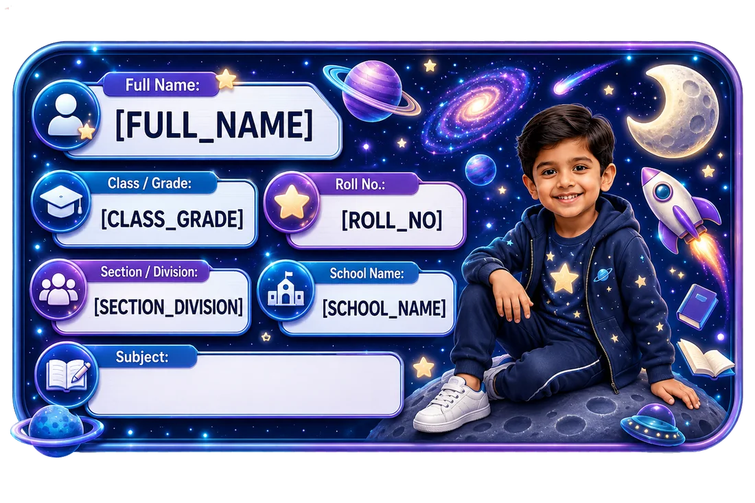
 Space Adventure Name Slip
Real Dimple product example.
VISIBLE → READABLE → UNOBSTRUCTED → CONSISTENT — a practical decision framework for school identification.
Space Adventure Name SlipReal Dimple product example.
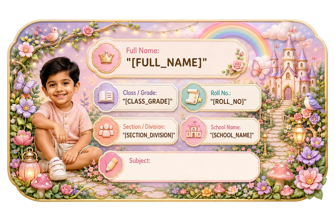 Fairytale Garden Name Slip
Real Dimple product example.
Editorial context, not a product claim.
Putting a child’s name on a school notebook sounds simple.
Then you sit down with a pile of books and realise there are several decisions hiding inside the job:
Where should the Name Slip go?
Front cover or inside?
How much information should be visible?
Should every notebook use the same position?
What if the cover already has a school label or subject box?
And what happens when a child’s name, class, section, roll number, photo and subject all need to fit into one design?
The best answer is not to find one “perfect” position that works for every book.
Instead, use four checks:
Visible → Readable → Unobstructed → Consistent
A useful school label should be easy to find, easy to read, placed away from important book information and used consistently enough that the child can quickly recognise where to look.
For many school books and notebooks, that matters more than decorating every empty part of the cover.
For most books and notebooks, choose a clear, flat area on the front cover where the child’s details can be seen without covering:
If the front cover is already crowded or the school requires labels in a specific location, follow the school’s format instead.
For books that need less publicly visible identification, an inside-cover location may sometimes make more sense.
There is no universal rule that every school book must be labeled in exactly the same spot.
The useful rule is:
Make the ownership information easy to find without hiding something more important.
| Item | Good starting location | Main thing to check |
|---|---|---|
| Textbook | Clear flat part of front cover or school-designated area | Do not cover title, school markings or barcode |
| Notebook | Front cover, usually in a consistent corner or open area | Keep name/class easy to read |
| Workbook | Front cover where it does not interfere with printed fields | Check whether the school already provides a name box |
| Project file | Front-facing flat area with enough room for details | Prioritise readability |
| Subject notebook | Consistent location across subjects | Subject and owner should be easy to distinguish |
| Tuition book | Front or inside cover depending on visibility needs | Keep school and tuition systems from becoming confusing |
| Library/reference book | Follow library/school rules first | Never cover official library identifiers |
This is practical guidance, not a school rule.
Before applying anything, check whether the school has already told parents how books should be labeled.
Some schools may want:
Name Class Section Roll No.
Others may provide a printed field on the notebook or ask students to write the subject in a specific place.
If the school provides a required layout or location, follow it.
A personalized Name Slip should make school organisation easier, not create a second competing system.
This is particularly important when:
An empty area is not automatically the best placement.
Think about how the book is actually used.
A label placed where a child naturally sees it when picking up the book is more useful than one hidden behind a fold, tucked near a binding or lost inside decorative artwork.
For a normal notebook, a clean area on the front cover is often a practical starting point.
But visibility does not mean the label has to dominate the cover.
The job is identification.
The child should be able to spot:
“That is my book.”
A teacher should be able to see:
“This belongs to Ananya, Class 1A.”
That is enough.
Before placing a Name Slip, scan the cover.
Look for:
A personalized label should sit around these elements, not on top of them.
This sounds obvious, but it is one of the easiest mistakes to make when the Name Slip design is visually attractive and the cover has limited space.
If the only open space would obscure something important, consider:
A school label can look beautiful and still fail at its basic job.
The child’s name should not disappear inside:
For many school items, the child’s name should be the strongest identifying element.
Then supporting information can follow:
The hierarchy matters.
A label where every line is equally small forces the reader to search for the most important information.
Do not begin with:
“Which Name Slip is prettier?”
Begin with:
“What needs to fit?”
Compare these examples.
ANANYA SHARMA CLASS 1A
ANANYA SHARMA CLASS 1 SECTION A ROLL NO. 11 SUBJECT: ENGLISH [PHOTO]
The second layout naturally needs more breathing room.
Dimple’s current Name Slip sheet includes:
20 large slips — approximately 8.5 × 5 cm
and:
5 small slips — approximately 5 × 4 cm
for one child/details/theme set.
The correct size is the one that keeps the information you actually need readable on the specific book.
[INTERNAL LINK: /blog/name-slip-size-guide-school-books/ — suggested anchor: Dimple’s Name Slip size guide]
Do not confuse the full sheet size with the size of an individual Name Slip.
Consistency can make school mornings easier.
If every subject notebook has the Name Slip in a completely different place, the child has to search each time.
A simple family system might be:
top-right on all notebooks
or:
bottom-right on all subject books
provided that area does not cover important printed information.
The exact corner is less important than the logic.
A consistent placement can help a child:
But consistency should never override the cover design or school requirements.
If one book has a barcode or school field in the chosen corner, move the label.
Both can make sense.
Useful when:
May make sense when:
The decision should be based on:
Do not assume the front cover is always mandatory.
If a child carries several similar notebooks, subject information can be very useful.
For example:
ANANYA SHARMA CLASS 1A MATHEMATICS
ANANYA SHARMA CLASS 1A ENGLISH
This can reduce the need to open each notebook just to see which subject it belongs to.
However, whether the subject is:
depends on the product and school system.
Do not duplicate a large printed subject title unnecessarily.
If the notebook already clearly says “MATHEMATICS”, repeating it in the Name Slip may add little value.
Roll number and section can help distinguish children with similar names.
But they are only useful when the school actually uses them.
They can also change with a new academic year.
That means a highly detailed label can become outdated faster than a simple name-only label.
Before ordering a large batch, ask:
Will this information still be correct when I use the remaining labels?
For a deeper privacy and field-selection guide, see:
[INTERNAL LINK: /blog/what-to-put-on-school-name-slip/ — suggested anchor: what information to put on a school Name Slip]
A photo can make a personalised Name Slip easier for some younger children to recognise visually.
It can also make the design feel more personal.
But it takes layout space and is an identifiable detail.
So the question is not:
“Should every Name Slip have a photo?”
It is:
“Does a photo add value for this child and this item?”
On an internal school notebook, a parent may make a different decision than on an item that is visible in public.
Use Dimple’s real preview to judge how the photo, name and school fields work together before approval.
[INTERNAL LINK: /how-it-works/ — suggested anchor: see how Dimple personalisation works]
Long names deserve special attention because label layouts are finite.
Compare:
IRA JAIN
with:
AARADHYA KRISHNAMURTHY
The second name needs more horizontal space.
The wrong solution is to make the type so small that it becomes difficult to read.
Instead, review:
The preview matters more than an abstract rule.
No.
A family can use:
if that matches the current Dimple product format and the label remains readable.
The two sizes exist because school belongings are not all identical.
Do not force one size onto every object purely for visual consistency.
Consistency of placement logic can matter more than identical dimensions.
Before placing a Name Slip, ask four questions.
Can the child or teacher find it quickly?
Can the important information be read without squinting?
Does it avoid covering the book title, school markings, barcode, QR code or other important information?
Is the location predictable across similar books where practical?
If the answer to all four is yes, the placement is probably doing its job.
The label should identify the owner without hiding what the book is.
If every field becomes tiny, remove optional information or use a more appropriate size.
A consistent system can make recognition easier.
Check school details before ordering and again at the start of a new academic year.
Information density should influence the size choice.
Do not cover official labels, barcodes, QR codes or school-required fields.
Check:
before approval.
If you have ten or twenty books in front of you, use a simple process.
Group:
Look for any existing:
Pick a clear location that works for most books.
Match:
Before finishing the whole stack, check one example carefully.
Then apply the same logic to the remaining books.
The idea is not to rush.
It is to avoid repeating the same mistake twenty times.
The article should not promise adhesion/performance on a surface unless Dimple’s current product information verifies it.
The practical advice is:
Check the exact product instructions and the surface before use.
A Name Slip being suitable for one paper-based school item does not automatically prove performance on:
If the use case involves water exposure, review Dimple’s separate Sticker product family, whose confirmed product truth is:
vinyl + waterproof
[INTERNAL LINK: /stickers/]
Do not transfer that waterproof claim to Name Slips.
This article owns school book/notebook placement.
Do not turn it into another general school-item labeling guide.
For a broader item-by-item decision, link to:
[INTERNAL LINK: /blog/what-school-items-should-you-label/ — suggested anchor: which school items are worth labeling]
That article should own:
This article stays focused on:
Use this final checklist:
Then approve.
A school-book Name Slip does not need a complicated placement rule.
It needs four things:
Visible. Readable. Unobstructed. Consistent.
Put it where the child and teacher can find it easily.
Keep the name and important school details readable.
Do not cover the title, subject, barcode, school-issued fields or other useful information.
Use the same placement logic across similar books when practical.
And choose the Name Slip size only after deciding how much information must fit.
The best placement is not the prettiest empty corner.
It is the place where the label does its job without getting in the way of the book.
Browse Dimple’s real Name Slip designs, choose the details you want to include and review the personalised preview before ordering.
Primary CTA: Browse Dimple Name Slips Target: /name-slips/
Supporting CTA: See How Dimple Personalisation Works Target: /how-it-works/
A clear, flat part of the front cover is often a practical starting point, provided it does not cover the title, subject, school-issued information, barcode or another important element. Follow the school’s own labeling instructions where they differ.
Either can make sense. The front cover is useful for fast identification; the inside cover may be preferable when the front is crowded or the family wants less publicly visible information.
For many books, name + class + section is a useful starting point. Add roll number, subject or school details only where they genuinely help and follow school requirements.
Dimple currently has large slips at approximately 8.5 × 5 cm and small slips at approximately 5 × 4 cm. Choose based on available space, name length, number of fields and readability rather than notebook type alone.
Not necessarily. Different covers and information needs may suit different sizes. A consistent placement system can be more useful than forcing one size onto every book.
Do not assume Name Slips have the same product properties as Dimple Stickers. Dimple’s Sticker family is confirmed as vinyl and waterproof; Name Slips should not inherit that claim without separate evidence.
Only when it adds useful information. If the notebook already shows the subject clearly, duplicating it may not be necessary. ---
Browse Dimple’s printed Name Slips for school details.
Browse Name SlipsThis guide is practical product guidance. Check the current product page and checkout for live availability, price and delivery information.